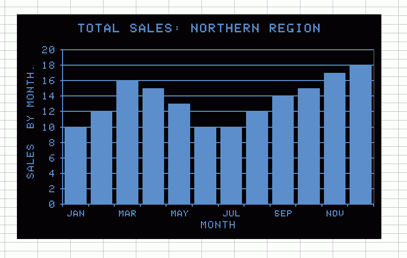
If you want to make your Excel charts look like they were made in 2010, instead of 1982, see the Excel Charting tutorials on Jon Peltier’s blog.
However, if you feel like kicking it old skool…
Problems:
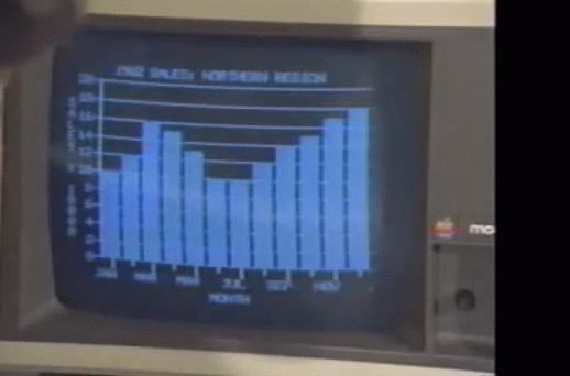
I couldn’t read the title and y-axis, so I took a stab.
I don’t know how to turn the y-axis text vertical like that.
I wasn’t sure how to get the x-axis tick marks in the center of the columns rather than in between them.
There’s a stray period in the y-axis text because Excel sucks sometimes.
You’re going to need these TrueType fonts to simulate the Apple ][ pixel font.
The RGB is 95, 142, 207
The gap width for the data series is 20.
The next time you have a board meeting, be sure to include a chart like this. Everyone will start reminiscing about their old Apple ][ machines and you’ll be a hero.
Pretty sure the top line is “1982 SALES: NORTHERN REGION”. Or maybe 1962, but that seems a bit old for an Apple II. No idea on the y-axis but your guess sounds reasonable. Very cool idea :)
The Y axis looks like it says Sales by (or *) Month. But it reads down, old-school like, rather than pivoting the text, a la:
S
A
L
E
S
B
Y
M
O
N
T
H
I think it says “sales * 10000?, to indicate the unit of the numbers (i.e. actual sales were $100000, $12000, etc).
and the Month Columns are centered on the ticks not between them
That’s great. What’s ironic is that your chart is in some ways better than some of Excel’s default charts (I’m thinking Excel 2000/2003 in particular)
I still have my Apple IIe, dual floppy drives, 64Kb (32 KB memory mapped). Great machine, with a copy of VisiCalc somewhere.
In those days, the AppleSoft Basic was all line edited, so I wrote a small 6502 Assembler app for providing a full windows editor, screen editor as we called it then. I called it ASE, Applesoft Screen Editor, my first commercial app.
Great fun in those days.
That looks like SuperCalc.
I am waiting for pong to show up
You can still download a free Visicalc Executable here
http://www.bricklin.com/history/vcexecutable.htm
complete with Apple II Help card!
Dick –
You left out the glare on the monitor screen.
I actually use the Shaston fonts quite often. they bring back fond memories and they are work in a variety of contexts
You can simulate the vertical text for the Y-axis label using a textbox in place of the axis label:
1) Click the chart to select it
2) Click in the formula bar and type your text in all caps with an ALT+Enter and space after each word
3) Reshape the resulting textbox so it is tall and skinny, with only one character showing on each row
4) Drag the textbox to the desired place for the axis label
5) Resize the chart so you have room for the axis label and numbers
As pointed out on Jon Peltier’s site, using a textbox gets rid of the need to type a period at the end of your axis label. I’ve found that wide screen monitors have this problem. This is a known bug affecting Excel 2000, XP and 2003: http://support.microsoft.com/default.aspx?scid=kb;en-us;870698 and I prefer my textbox fix to Microsoft’s suggestion of giving up the wide screen and returning to a 4:3 aspect ratio.
Brad
There’s a youtube clip here: http://www.youtube.com/watch?v=GT3f4fimbD4
For vertical text on the Y axis:
Right-click the vertical axis label, click Format Axis Title
Click Alignment
For Text Direction, select Stacked
I see Deb’s beaten me to the easier way to get the stacked axis title. I suspect if you used either approach (stacked or returns between characters) there’d be no problem with a truncated axis title, since the text direction is nominally horizontal.
Also, there’s no need for a period at the end of the title to prevent truncation. Use one or two non-breaking spaces. Hold Alt while pressing 0160 on the numeric keypad.
Dick said: “I don’t know how to turn the y-axis text vertical like that.”
That’s one of the things I like about you Dick, you’re never afraid to admit there might be something you don’t know about Excel. Very human, and not something that everyone is comfortable doing.
Ok, I have a way to accomplish the tick mark in the middle of the series instead of in between. It’s a little (read a lot) out there. This is Excel 2007
1. On the X-Axis, remove all tick marks and set the line color to “No Line”
2. Change all of your data fields to |Month name, that is a pipe character (above the enter key) followed by the new line followed by your text. This creates a “Psuedo Tick Mark”
3. Adjust the X axis crossing on the Y scale until the pipe character ends on the line
4. Set the chart type to “Stacked Column”
Charles –
When you change the Axis Crosses property of the Y axis, you are changing the baseline of the bars, thus distorting your chart.
Also, tick marks on the month axis here are merely chart junk. At least newer versions of Excel (i.e., starting with the first version of Excel that did charts) let you remove unneeded features. Unfortunately they make it all to easy to include unneeded features.
Jon, as I originally stated this is a bit out there. I realize that moving the Axis Crosses property distorts the view, hence why I specify that you must use a Stacked Column type, that forces the columns to always go to 0 instead of stopping at the axis crossing. Yes this is silly, but was simply illustrating a way to make an 2007 chart mirror one from 3,000 years ago :)
Charles –
I never noticed that the stacked chart preserves the zero baseline. Learn something new every day.