After week 8 of my golf league, I decided to have a chart-of-the-week. Now, for the first time ever, you can view all the charts o’ the week in one place with author commentary.
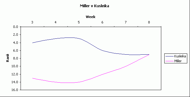
Week 8
After scoring week 8, I noted that I was plummeting down the leaderboard while Miller seemed to be scoring well each week. I thought I would chart it out to see what it looked like. It was such a hit, that I decided to make a chart every week; sometimes two. I used smoothed lines, but in retrospect I shouldn’t have. I think smoothed lines gives a sense of imprecision. That’s OK if there is some imprecision in the data, but this data is rock-solid.
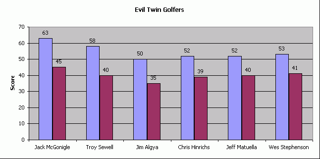
Week 9
This week Jack shot a 45, which is a pretty good round for him. I thought I’d see what his highest round of the season was and that lead to showing the top five golfers with the largest difference between best and worst rounds. I must have been particularly lazy that week because I always change the plot area background to white. I couldn’t come up with a good way to show the dates of the rounds, so I just left them off.
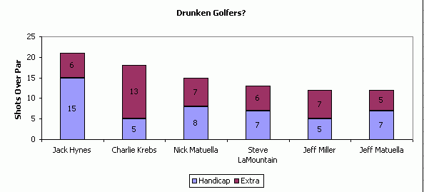
Week 10
Charlie is a sub and was working off of last season’s handicap. For those of you unfamiliar with golf, your handicap is an indication of how many strokes over par you should shoot. Charlie shot 18 over par, but his handicap (based on his past performance) indicated he should shoot 5 over. I tried sorting this based on the maroon section, but it didn’t look as good. You might note that I can’t seem to change those default data series colors. But when you see examples where I do change them, you might not think it’s such a bad thing.
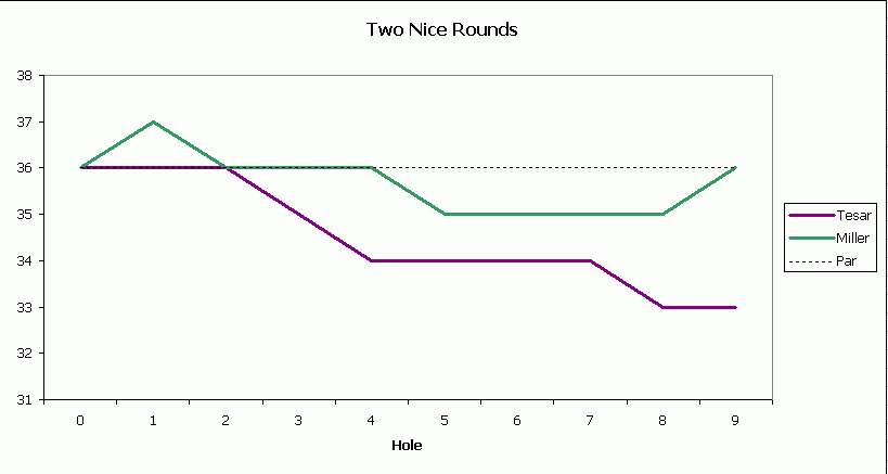
Week 11
Tesar had an amazing round, but I didn’t want to leave Miller out of the prop-fest. While I gave proper respect to the people who performed so well that week, this chart is really stupid. Does it really convey anything that posting a score card wouldn’t? Maybe it does, or maybe I had trouble coming up with a good chart that week. You try coming up with one every week. I wasn’t enamored with the “Par” data series because it gets obfuscated by the other series through most of the graph.
Week 12
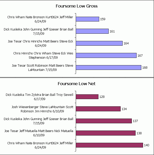
John, Jeff, Brian, and I all shot well in Week 12. In the clubhouse, there was some talk that we may have the lowest total foursome score of the season. It turned out we didn’t. But out of 14 two-man teams, you’ll note that I appear in three entries. And yet, Brian and I didn’t finish in the money. This chart wins the “I wish” award. The labels are too big. The label should be the date and it should be a stacked bar chart with each of the four component scores. Ah regret.
Week 13
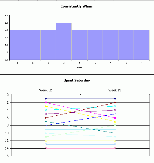
Upset Saturday is what college football fans call that one Saturday every season that a lot of favorites get beat and the polls get shaken up. Week 13 showed a lot of movement in the rankings and I wanted to create a chart that demonstrated the chaos of the week. The resulting half-finished chart, shown below, is what the Spaniards call la abortion. I made 14 series for the 14 teams. I can’t come up with two non-default colors that match, so 14 was out of the question. After I changed the colors of the first three teams, I briefly considered writing a macro, then quickly gave up and created “Consistenly Wham”. That chart (on the top) shows that Wham shot a four on every whole but one. I still think “Upset Saturday” is a good idea for a chart, I just don’t have the skills.
Week 14
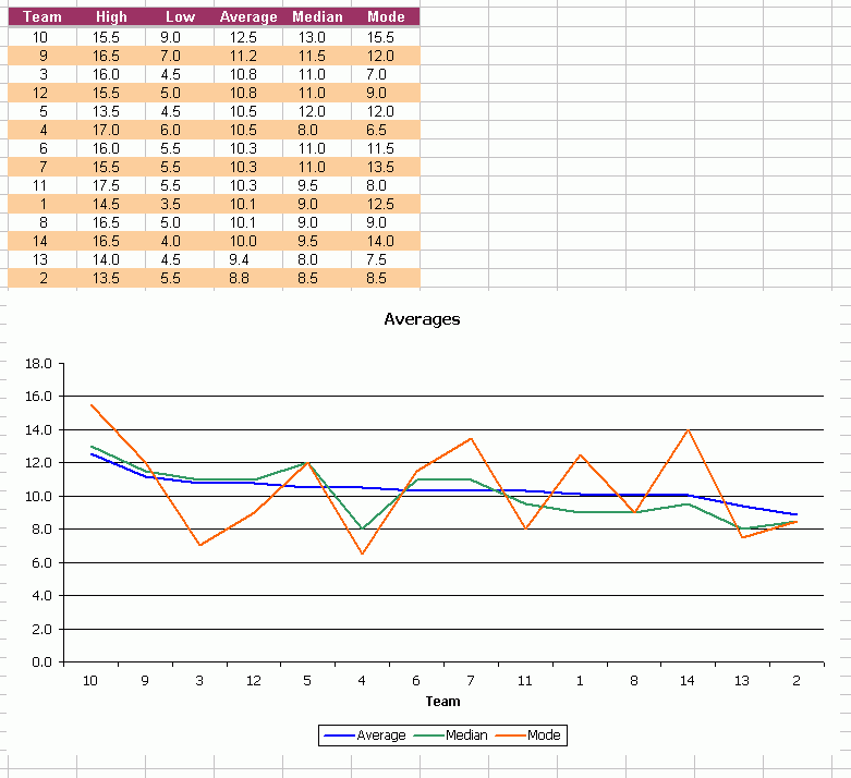
In this penultimate week, I wanted to show how the teams got where they are today with some basic stats. After computing the mean, I thought it might be interesting to see the median and mode. Then for a reason that still escapes me, I charted them with a line chart. I think line charts indicate the passage of time. This chart clearly should have been a column chart. It wouldn’t look as pretty though.
Week 15
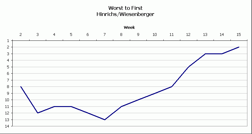
Hinrichs/Wiesenberger shocked the field with a second place finished. Considering they were 13th not too long ago, they deserved some props.
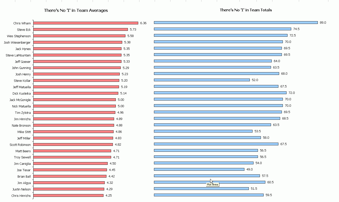
Early in the season, Steve Eck wanted to know how he could easily see how his partner was doing individually because his back was hurting. As his partner was Chris Hinrichs, his suspicious were well founded. I started with the total score but quickly realized that it was not sufficient. Not everyone played every week (they had subs) and there are team points that don’t get assigned to any one individual. I computed the average, which I thought was a more interesting metric. I ended up with two charts and no axes. I had to line them up manually, but I think it came out well. I wish they weren’t so big, but it’s the only way I could get all of the names to show. Click to embiggen.
Hi Dick –
I can’t grasp Week 11. Vertical axis looks to be course par, but horizontal axis is by hole.
Shouldn’t the vertical be 1 to 10 (12?) and then the Par series move according to the hole?
Or if par centered, what’s with 36?
…mrt
Yeah, the y axis sux. 36 is the par for 9 holes. Where it says 36, it should say 0. Then it should go +1, +2, etc. up and -1, -2, etc. down. For the scale that’s shown, it really shows what they would have shot if they parred every hole after that hole.
The way it reads (to me) is that Miller bogeyed the first, birdied the second, birdied the fifth and bogeyed the last. Two bogeys, two birdies, everything else par. Tesar birdied three, four, and eight (and parred everything else) for a three under 33.
Good to see a keyboard-using number-cruncher trying his hand at data visualization. I have just a few small comments.
“Miller vs Kusleika”: use lines with markers, and use straight lines, not smoothed lines. Smooth lines lie, and without markers you can’t tell how badly.
I don’t get “Two Nice Rounds”. It looks like it should be shots per hole on the Y axis, and I don’t even need 36 shots per hole.
For “Upset Saturday”, hide the gridlines or make them as light as possible. Use only dark colors for the lines (they could even all be black), and label both points with the name, on the left of the first point and on the right of the second. Alternatively you could try a scatter with first rank as X and second as Y.
“No ‘I’ in Team”: If you look real close, you can see ‘me’. I’m not sure what the bars charts are showing.
Thinking about ‘Upset Saturday’…
In an analogy with the way stock prices & volumes are sometimes charted, I would consider plotting the weeks 1 to 13 on the x-axis, and two panel charts for the y axis, the upper chart being a line graph (as you have done above for weeks 12-13, but for all weeks) to plot the ranks of each player each week. They could all be the same colour for the purposes of the chart. Then below that in the second panel I would plot a column graph, the value for the y-axis being the sum of absolute change in rank for all players. So, for the above displayed data, week 13 would be 24 by my reckoning. This would hopefully stand out from previous weeks and provide the contrast you need to demonstrate the ‘upset’ week it was.
I’d like to see that plot, and see if it really does stand out. If it doesn’t another metric you could use for ‘upset-ness’ is to calculate the sum of %change in rank. So a player dropping from rank 1 to 4 (300% change) would be much more significant than a player slipping from 11 to 14 (27% change). This tactic might better reflect how changes at the top end of the leaderboard may be percieved as more significant to observers and commentators – the real ‘upsets’.
Rick
Here is a golf chart you might find interesting.
It’s an XY scatter chart with some trig formulas that draws a 3D model of the golf swing. It can be rotated
to any angle, and used to isolate the actions of different body parts.
It’s something I’m trying to market, but I’m happy to discuss the techniques used.