I like finding data sets on the internet. Like at mathforum.org and other resources at mathforum.org. Now we can answer the age-old questions like, Where do women outlive men by the largest margin?
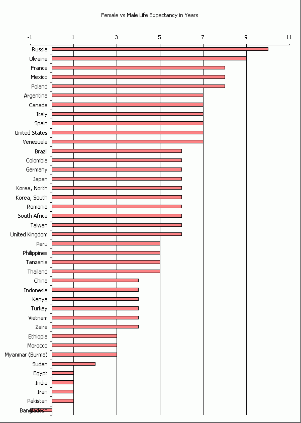
I guess they kept the women-folk away from Chernobyl. It does raise the question of why I can’t prevent Bangladesh’s label from overlapping its negative bar, but I suspect someone will chime in in the comments.
And questions like, How did Dick’s college tuition compare to the most and lease expensive colleges?
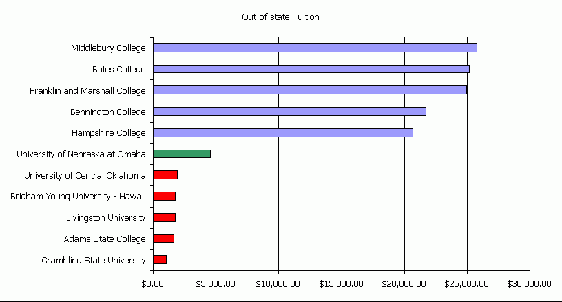
I’ve never heard of those top schools. Number 6 was M.I.T. – I’ve heard of that. On the low end, I’ve heard of Grambling because one of their football games is inexplicably televised every year and their former coach, Eddie Robinson, won 17,000 games in his career (maybe it was 400, but it was a lot). Then there’s Adams State, attended by both my wife and my uncle, although not at the same time. I asked my wife who Adams was, but she didn’t know. From ASC History and Facts
Billy Adams, a Colorado legislator who would later become governor, worked for three decades before obtaining the authorization to found Adams State Normal School in 1921. His goal was to educate teachers for remote, rural areas, such as the San Luis Valley.
I’ve been using Bug Shooting as a screen capture program recently (alternating between it and Snagit, actually). Apparently I’m not skilled enough to either include or omit all of the chart borders. But what do you expect for a $4,500 education.
Men live longer than women in Bangladeshso you are trying to chart a number that is less than zero. If you don’t want the bar to overlap the country name, then you need to move the origin of the bars to -1. You can do this by right-clicking the Value axis (on the bottom of your chart), choosing Format Axis from the pop-up, going to the Scale tab, then specifying that the Category (X) axis crosses at -1.
Though the overlap problem is fixed, I think that the appearance of the resulting bars is somewhat misleading.
Brad Yundt
Isn’t the overlap just a matter of changing the Tick Mark Labels for the X-Axis to “Low”?
If you’re on 2007, I couldn’t tell you.
I couldn’t stand the thought of outliving my wife.
For this reason alone, I will not travel to Bangladesh.
Brad –
Allowing bars to start at a value other than zero is a sin.
Chip’s method is one of the accepted techniques, and yes, it works in 2007 as well. Despite my many rants, they didn’t totally break 2007.
I’ve decided to write a blog post on another way to get nice axis labels in a bar chart when some values are positive and others negative. Maybe it’ll run tomorrow, maybe next week.
Oh, and Dick, it’s easy to turn your chart into an image file. Remove the border, then use the Enhanced Export Chart Procedure technique, or scroll to the bottom of the page and download my little utility (it’s free!).
I’ve written a tutorial showing how to make Category Labels That Don’t Overlap the Data. Thanks for the inspiration.