I recently discovered how quick it is to create a simple Gantt chart in Excel.
The following example was created for Excel 2003. It should work the same for other versions.
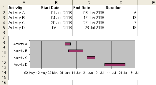
Create a worksheet similar to the above table.
Note: the formula in column D2 is =C2-B2. You’ll need to set the Cell Format back to General, or column D will look like a date.
Select just the Activity and Start Date data (eg. A1:B5), then click the Chart Wizard.
Step 1 of the wizard:
Select the “Bar” Chart type, and the Stacked Bar sub-type, then click Next.
Step 2 of the wizard:
Click the Series tab, and Add another Series.
For Name, select the cell for the Duration Column Header (cell D1)
For Values, select the cells for for the Duration data (cells D2:D5)
Click Next
Steps 3 and 4 of the wizard can be skipped, though, on Step 3 you may want to hide the Legend.
The idea from here is to make the Start Date bar invisible, so only the Duration bar shows.
Double click on any one of the Bars for the Start Date data.
From the Patterns tab, set the Border and Area to None.
You may also notice the Activities are in reverse order.
Double click the Y axis (Category axis). A “Format Axis” window should appear.
From the Scale tab, tick the “Categories in reverse order” and “Value (Y) axis crosses at maximum category” are ticked.
You’re finished!
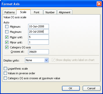
As an extra, you can force the chart to graph only between certain dates.
Double click the X axis (Value axis). A “Format Axis” window should appear.
From the Scale tab, override the Minimum and Maximum boxes with Dates (I didn’t know it could take dates, did you?!)
Very cool
Microsoft broke the axis scale dialog in Excel 2007. You can only enter dates for a date-scale category axis in 2007, whereas you could also enter dates into the value axis dialogs in earlier versions. In 2007 you have to enter the whole number value for the date (which appears as 39609 for Category Axis Crosses At in Dicks example). This is a peeve I forgot to mention in my recent blog post, Changes to Charting in Excel 2007.
Jon: I must admit, I discovered the “date in scale boxes” feature from an article you wrote. Perhaps I should have credited you in the post – better late than never :P
For those of you who dont know, under the surface, Excel stores dates as a number. The Number of Days since 1-Jan-1900*
So, just like you can format a number to display 2 decimal places, you can format a number to display as day-month-year.
To display a date as a number, change the Cell Format to General.
* Excel actually stores dates as the Number of Days since the day before 1-Jan-1900, but it’s rarely important to know this, and this date is easier to remember.
Rob –
Funny thing. Back when Lotus 1-2-3 was the spreadsheet of choice, they decided to use the number of days since 1-Jan-1900 as the date. But the programmer in charge of coding this didn’t know the leap year rules. You know, if the year is divisible by 4, it’s a leap year, unless it’s a century (divisible by 100), in which case it isn’t a leap year, unless of course it’s divisible by 400, when it is a leap year. 1900 was not a leap year, but if you put 1-Feb-1900 in cell A1 and fill down to A29, you’ll see the date in A29 is 29-Feb-1900 instead of 1-Mar-1900. So for dates since 1-Mar-1900, the stored value is the number of days since the day before 1-Jan-1900.
At the time, Excel was the young upstart, so Microsoft intentionally included this bug for compatibility with 1-2-3. Amazing how so many articles I’ve read blame Microsoft for this bug.
One more OT comment in favor of Microsoft, brought up this morning my my daughter. Next time someone is telling you how much Microsoft is the evil empire, and Apple is such a great company, ask them how much they like Apple iTunes.
I’ve seen many articles on creating Excel Gantt charts over the years and I’m curious to know if folks use them in actual projects, because even fairly modest projects I’ve done required somewhat more functionality than these articles usually discuss. The question isn’t targeted to Rob’s post per se, but the post did remind me of the curiousity I’ve had for a long time.
For example, how do you handle defining predecessor tasks on the worksheet, or showing task dependencies on the chart?
Colin: I have been asked about graphs many times and have offered up various solutions, this being just one of them.
I personally would not use this graph for a project time line.
I have used Gantt charts made this way for project reporting. Not for project management, because of the lack of easy dependency tracking. It could be done in Excel, but why bother, when Project handles it. However, for simple reporting, or even semi-complicated reporting, the Project graphics are awkward and kludgey, and it’s easier to get this simple Excel chart to behave. Or even the more advanced version, with milestones and other enhancements:
http://peltiertech.com/Excel/Charts/GanttChart.html
Well, I started thinking more about the dependency issue and it shouldn’t be that difficult to address. The start date of a task is either a manual entry or based on a predecessor task and possibly a lag time. So add an ID column, a predecessor column and a lag column. If an entry is added in the predecessor column, invoke a worksheet change event that would write a lookup formula in the corresponding start date column. The lookup formula would use the ID in the predecessor column to look up the finish date of the task ID. If there’s a lag entry, add that to the formula. If the user subsequently overwrites the formula with a date, invoke another worksheet change event that displays a message confirming the entry and removing any entry in the predecessor column. If an Excel 2007 table is used for the task entries, the ID column can be a calculated column that’s incremented automatically when a new row is added to the table.
Other columns, such as percent completed can be added to the table and displayed on the chart. And Jon’s technique for adding milestone indicators using line chart markers can also be incorporated.
Of course, things can become quite complicated, depending on the additional functionality required. As Jon points out, Project already handles all the messy stuff so it may not be worth the effort attempting to use Excel for project planning anyway. FOr project reporting, I agree that Excel can be a useful tool.
Hi, I just found your site, while researching Excel Data Visualization Experts. I really like some of your posts. I’ve been looking for Excel data tool sites? Do you know of any? I’d enjoy connecting by email if you do. My client’s site is http://www.tableausoftware.com/fast-analytics if you’re interested. I like your blogs.
I loved the bit of Lotus 1-2-3 trivia. I used to really like Lotus back in the day and really found it very straightforward to use. I’d no idea about the leap year issue though.
Btw, I think Apple’s iWeb could safely be added to iTunes as a software pariah.
Funny thing about 1-2-3. Everyone in my group was using 1-2-3 except for me, because I had the lone Mac. On the Mac I used MS Word 1.0, and some dumb shareware for data analysis and charting. My PC colleagues were running Windows 3, but all their apps were DOS programs running in DOS windows (actually, they were POS programs, but I digress). They used 1-2-3, WordStar or WordPerfect, and this real WYSINWYG (N = NOT!) drafting program.
Then I got a PC because the company was standardizing. I hated all the DOS software the group was using, I mean, it was all utter crap. I hated WordPerfect, and I hated WordStar. One of the guys had Word for Windows, which he didn’t like, so I installed it, and the Word environment in Windows 3.1 was identical to that in the Mac, only now I had two buttons on my mouse. Progress.
I tried but couldn’t stand the DOS version of 1-2-3, never tried 1-2-3 for Windows, but I got Excel. I don’t recall which version, but IIRC it predated XLM, so it was a long while ago, early 90’s. Even then, when 1-2-3 was the market leader, Excel was way better, its interface had benefited from years of programming for the Mac.
This is a cool trick.
Was just wondering if you or anyone else knows how to plot a bar graph within an image?
????,??????
Was just wondering if you or anyone else knows how to plot a bar graph within an image?
—-see this blog ,picture your chart :http://excelpro.blog.sohu.com/91480827.html
Andrew: you can set a background picture for a chart.
Right-click the Plot Area > Format > Fill Effects > Picture > Select Picture.
The point is, you have to add images to charts carefully, if at all. Most examples I’ve seen shout out “Forget the data! Look how clever and artistic I am!” The unfortunate reader has to play a game of “I Spy” or “Where’s Waldo” with the data.
[…] van Gelder (of DailyDoseOfExcel fame) shared a tip back in May on how to build a simple Gantt chart in Excel. I’m posting a link here because it’s the easiest I’ve seen so […]
Exactly what i was looking for the milestones section of my business plan! Simple and easy. Thanks!
i found this step by step guide very useful in creating the gantt chart i needed for my project. thanks alot.
Yeah It s very simple template . But It would be good if we put color like a colorful template it will be great Do u think so?
The new databars/sparklines features provide nice ways to do Gantt Charts and resource histograms, here’s a sample:
http://img203.yfrog.com/i/gantt.png/
There’s probably a more direct method but one way to achieve this is first set up your table, called A say, then to create the databars, set the min and max formulas equal to defined names Min:=MIN(A[Start])-A[@Start] and Max:=MAX(A[End])-A[@Start]+1. You can copy down individually with the format painter to propagate. After create a separate range for the resources and add a column sparkline to a cell as shown.
I use EasyProjectPlan (www.easyprojectplan.com) which is an Excel Gantt Chart and Project Plan that syncs with Outlook and MSProject.
http://www.easyprojectplan.com
I use the Outlook and Calendar sync features to distribute and collect task information to my team members.
I distribute the EPP Excel file to all team members either by email or I post it in a shared folder.
My team members can edit the EPP excel file and send the changes back to me.
Most of the companies I work for have no PM task management system so EPP allows me to walk onto any project and immediately distribute and collect task information to all team members. Considering that most companies use Excel and Outlook, there is nothing to install on any computer.
In my experience, team members prefer to view task information in Excel and Outlook.
I would like to do something similar. I have repetive tasks each month that are due on a certain day #. These are fixed day #’s each month. I would like to visually track the task to see the actual delivered day# vs the due day #. Can I see the tasks as columns and the months as rows and a gannt chart to show the results?
I cover a very similar tutorial but using Excel 2010. So simple to create! Thanks
Thank you very much! Saved me a lot of time!
This is great! Microsoft has a similar tutorial for 2003 (I’m in 2010) but I just couldn’t grasp what they were really getting at with their steps. Your single line “The idea from here is to make the Start Date bar invisible, so only the Duration bar shows.” cleared it right up, thank you!!