Process Trends had a nice post about charts today. I checked it out immediately because it’s a chart that I’ve always wanted to do. I’m woefully inadequate when it comes to charting, so I’ve never even tried it.
I added some progress bars to show actual progress against schedule.
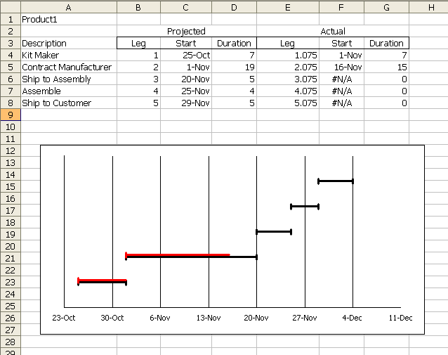
I added a second series designated as ‘Actual’. The Leg column is the formula =B4+0.075. That number needs to change if the chart is resized though. At least if you want the actual bars to be right next to the schedule bars.
The formula for Start is =IF(G4=0,NA(),C4+G4). This produces an #NA! error for any leg that hasn’t started and #NA! errors don’t get plotted. The actual start point is the point that represents the progress to date. I wanted to use a minus error bar so the left end would have the vertical thingy, but the right end wouldn’t.
Ideally, I would like to use a ‘Both’ error bar if it’s complete and a minus error bar if not. It might actually look better if I eliminated the vertical thingies on the red bar altogether. If I did that, I could use the same start date as the projected and a plus error bar for the actual duration. The actual duration is a hard-coded number.
It’s not quite a replacement for MS Project. Yet.
Dick –
You can use a stacked bar chart as well:
Gantt Charts in Microsoft Excel
Advanced Gantt Charts in Microsoft Excel
Dick,
I think Jon’s advanced Gantt is the best solution I’ve seen so far. I, in turn, solved the problem using VBA to plot rectangles on a sheet. This is less elegant, but fits with the layout requirements I had.
I constructed an extensive Excel/VBA solution a couple years ago which set up weeks and months in a worksheet, with tons of labels, and Gantt bars with more than the three colors that conditional formatting would allow. In the headers there were merged cells to make the month headers span the week headers. A nav panel directed the user to different sections of the worksheet, which broke down the data differently (by department, by product line, etc.). Labels through the chart gave summaries of % implemented, $ savings, manpower, etc.
Prior to my program, the client had hand drawn their charts, sent them to a graphics designer, and waited two weeks for a chart. Any changes took the same two weeks. My program could redraw the chart in 4 or 5 seconds. A savings of 99.9996%!
Thank You, Dick, for sharing this tool with us.
It has always disappointed me that project related software tends to have limited and absolute time scales only.
What about planning manufacturing operations of small durations, such as machining or robotic assembly? These and other similar, repetitive and overlapping operations are not unlike activities in a single project, regarding their planning.
I do not know a general project software that would allow 0.27 sec for “positioning” or 2.67 sec for “shaft turning” in an imaginary Swiss watch making process, for example.
Now, your charting tool seems to have scope for this kind of project planning, too.
I once had to make a series of Gantt charts from a simulation output. It was very inefficiently done in VBA, but the core of my idea was pretty nice. I used stack bars and had a quick macro that would change the color of the bar based on the cell next to the bar’s value. I definitely was no replacement for Project, but kind of neat…
Dick,
Looks nice and clean. Like almost everyone I’ve had a try at it and ended up with using a grid of cells along with conditional formatting. The advantage of this is that you can add a line which totals up all the tasks and generates a resource profile over the project. My example here doesn’t show that, but it is easy to add a resource percentage column and then modify the formula to display that value in the appropriate cells. Take a look here:
http://masamiki.com/project/Excel.htm
As for the question of manufacturing planning on small timescales, Project’s smallest increment is the minute, but you can simply read minutes as seconds and hours as minutes, but really, project is not the best tool for that job. There is software for this type of modeling which would be better suited for it.
actually I do use ganttproject which is a free software and can save to project files etc…
it can also export to CSV (and import) and import from project as well.
I tried first in excel but the problem is each time you send it to someone they do manage to mess with something, and it usually isnt that user friendly
Alderaic –
Don’t send the original Excel workbook. Make a copy of the file, copy the chart as a picture (hold Shift while clicking on the Edit menu and Copy becomes Copy Picture, then choose the On Screen and Picture options), then paste the picture (regular Paste) and delete the original chart.
Hello guys,
I’m from Belgium so sorry for poor English.
I have a problem.
What if someone gives you like 100 taxitours to do.
It’s a little bit the same as the tasks.
1) One start at 6:00 and ends at 8:00
2) another starts at 8:10 and ends at 9:00
3) yet another starts at 6:20 and ends at 8:30
You only need two taxidrivers, cause one driver can do 1 and 2 and another one 3.
But how can you organize this with excel.
I mean a chart where excel puts al drives possible after eachother, so to minimilize drivers.
Please contact me, cause I really don’t know how to solve this problem.
Probably I’ll have to use VBA.
Thank you verry much!!
I finally started using those charts in excel (using jon advanced gantts) but with some variations,
I run multiple projects at once so I made one main chart to track multiple other charts
(each projects has a total line showing the overall advancement of the project which is in turn being linked to the main chart showing all the projects advancement)
Though I would like to put the last task label in another color so the total is a bit more visible, but no luck yet, even looking through all of jon’s charts. is there any axis trick to do it or the only way would be to stack a dummy chart on top of it ?
anyway thanks for all the tips found in that thread.
oh and I also combined that with some vba to refresh timelines (axis scales). I didnt use the UDF way though as I truly hate those and you seem to need a permanent calculation going on to make it wor, so it is just a button push which IMO is more than enough as you just need to change your projects from time to time and clicking a button isnt that difficult.
Regards (if anyone want I can do clean version of that gantt workbook and host it somewhere)
By task label, are you referring to a category label on the vertical axis? These have to be formatted the same. There are alternatives, though: you could format the bar in a different fill color, for example, or you could apply a label to that bar only.
thanks Jon,
I indeed gave it some thought for the last row but as I add/remove tasks/projects I need a macro to set it back to regular and change the new last task to those settings.
I might end up doing it but I feel too lazy right now.
for the label as I print the chart and go with it to meetings etc… I need to see all the labels.
though it is in fact visible enough that the last row is covering the full period and indicates the progress, Actually now I will more focus on adding percentage complete over the chart itself for each tasks
Very creative way, thank for the tips that I get daily from Daily Dose of Excel.
I tried the method, because my Excel somehow did not come with X- error bar in line chart, so I use bar chart instead, I find bar chart could achieve the result better
1)To achieve the distance of actual lines to the projected lines, what you need to do is to format the data series and select option then set the overlapping to 0 or any value that gives you the effect.
2)For the Y – axis, instead of using the “leg” in column B , you can use the “description” directly.
I thaught the idea of generating a #NA error for value of the cell that you don’t need to show in the chart is a top idea, I have never thaught of that.