OK everyone.
Here is a (poorly designed) chart showing the result so far.
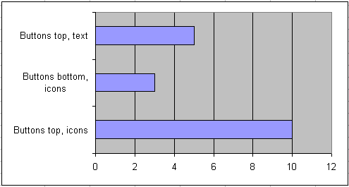
It looks like the icons at the top are winning. I agree however that for beginners, buttons with text might be better.
I have cooked up an option D though. What about this one:
So which is it? A, B, C or D?
Regards,
Jan Karel Pieterse
JKP Application Development Services
How about a text/no text option switch ?
How about making use of the picture property along with a caption. Setting the PicturePosition property to PicturePositionLeftCenter. The size of the button would slightly larger than those in your C screen shot. But there appear to be enough empty space at the top right.
The option to display picture, text , picture+text would be a bonus.
D clearly
Of those options, I’d plum for A (icon’s on top) – but Andy’s suggestion is worth exploring.
As far as icons go, I’ve always wondered why the evaluate icon departs (only slightly) from Excel’s standard evaluate icon (Control ID 5687). A copyright issue?
cheers,
Christopher
D
I think the labels clutter the user form. Let people set an option if they want, but I think nice clear tooltips are adequate. I’ll stick with “Buttons top, icons, no labels”.
Alex: I am more and more inclined to do that one. Bit of work, but I think worth it.
Andy: I think having both icon and text will make the buttons too wide to fit on the dialog. Especially the German “version” has long texts.
Christopher: No idea why this icon differs, Charles designed some of them and I did the others.
Jon: I agree, my vote goes to A or C, user selectable.